Renter-Friendly Bathroom Renovation
One of the best parts about living in a historic building is the innate charm and character automatically built into the space. We’ve got crown molding, built-ins, and an original phone nook in the hallway. It’s awesome. The part that’s not so great… the bathroom. Yikes. It hasn’t been fully updated to be 2019 friendly and it shows. Strange red tile around the floor/tub. Crumbly grouting. Before we moved in, the outlets weren’t up to code, so those were replaced, thank god, and we requested a new toilet, which made us feel better, but overall the bathroom felt like an old cave. Not ideal.
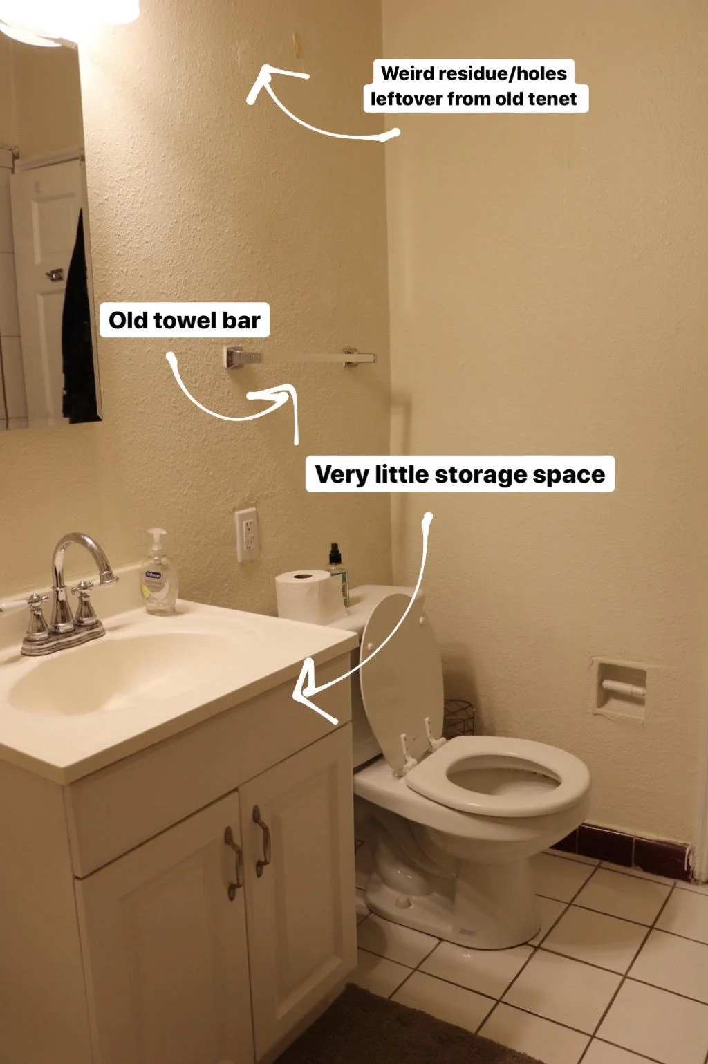
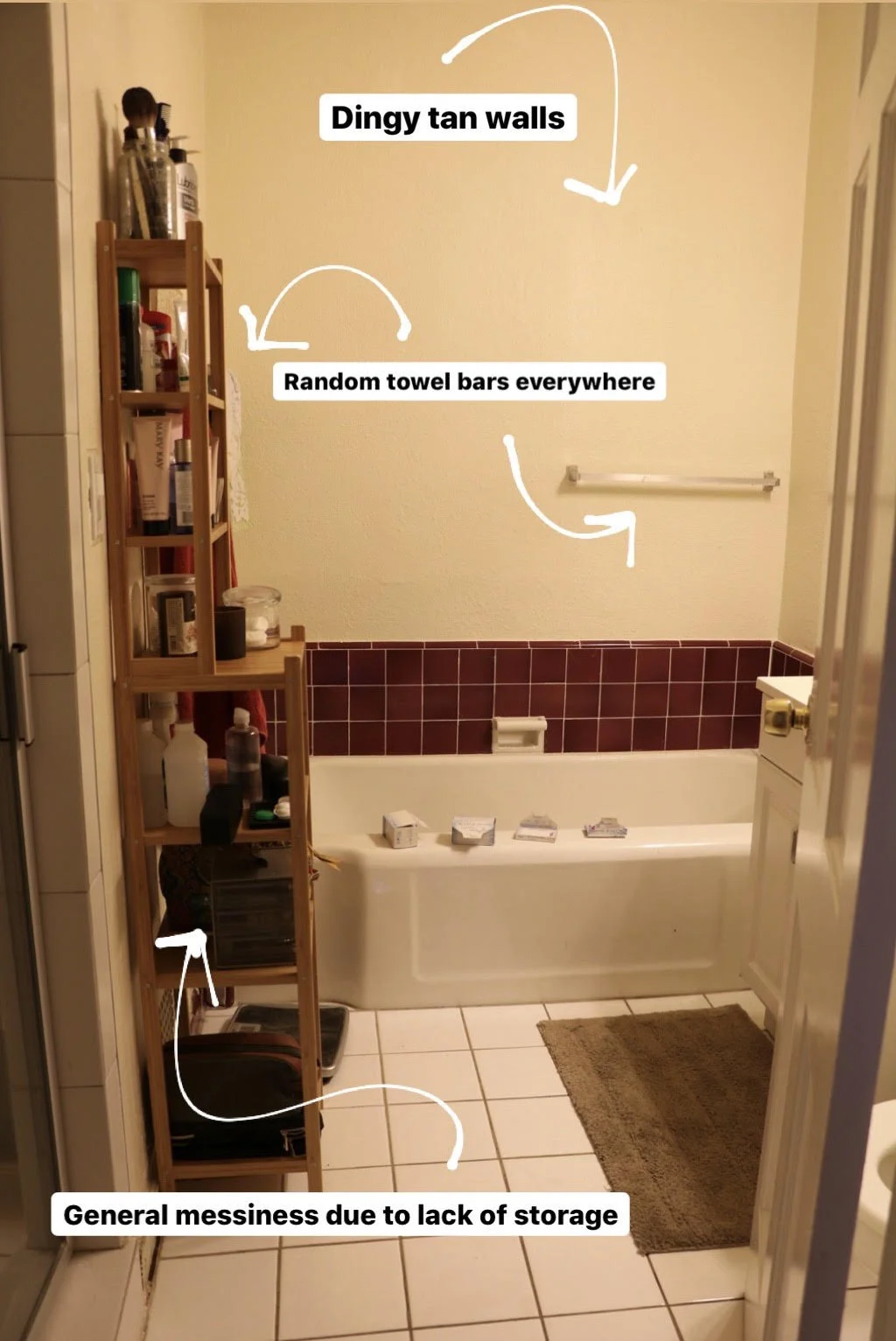
If we owned the place, we’d definitely consider a full gut and renovation. But since that’s not the case and we’re renters, I had to get creative on how to do a renter-friendly renovation to make the space feel livable and fresh. Here are some of the things I thought were issues in the ‘Before’:
To start off, I painted it white. WHAT A DIFFERENCE. It’s one of those things that I notice (because I remember how stale it looked before) but any other person who walks in wouldn’t even register. I was devilishly happy with the paint color. I went with Behr Premium Plus Ultra in New House White. There’s actually a slight red undertone mixed in with the white (if you’ve ever bought white paint, you know that there a quite literally hundreds of options). I figured since I can’t change the red tile, I may as well embrace it! The quality of this paint is fantastic, I highly recommend spending the extra money and going with Behr. Typically one coat is all you need.
Oh - I forgot to mention that before painting, I removed all the towel bars. Since I had a more visually appealing towel hanging option in mind post refresh, all they were doing was taking up space and looking creepy. (Can a towel bar look creepy? I assure they can…) I also patched up all holes in the walls using Spackle. Make sure to give enough drying time before painting.
Here’s what you need to refresh your rental bathroom:
Paint
Modern shelving
New towels
Modern Art
Storage towers
Storage bins
Candles
Disclosure: My content is reader-supported, which means that when you purchase through links on my site, I may earn an affiliate commission. Learn more here.
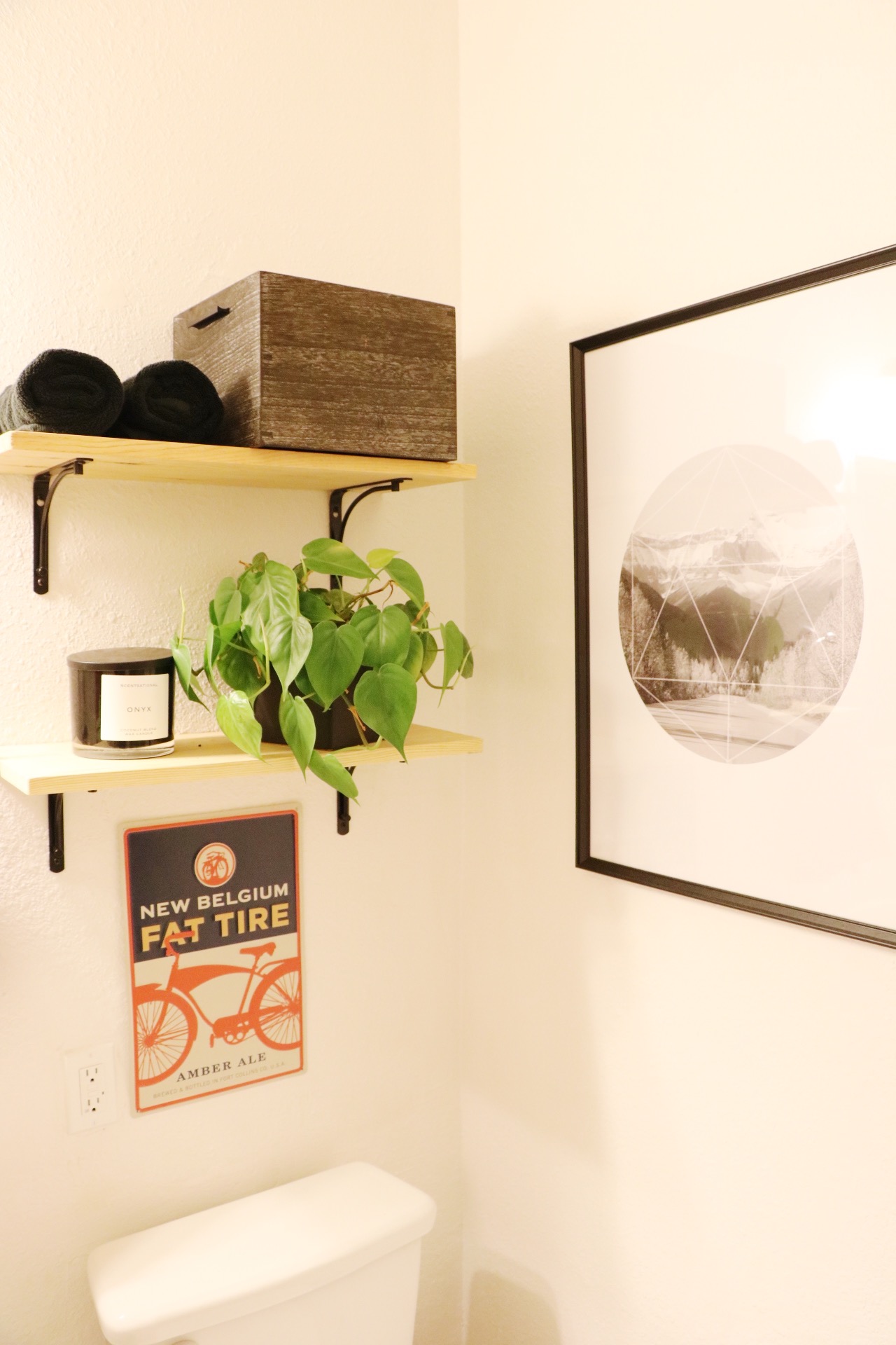
So much better, right?? I made the shelves using pieces of wood stained to match the storage rack on the opposite wall, screwed into the ‘L’ brackets, which were then screwed into the wall. Seriously easy. Since open shelving is such a thing right now, I think just these shelves make the space feel more modern.
I promised I’d show you my alternative towel-hanging-options and BEHOLD. A towel ring. Ground breaking, I know, but I really think this works better with the new wood shelves, and it’s in the perfect place for all your hand washing needs.
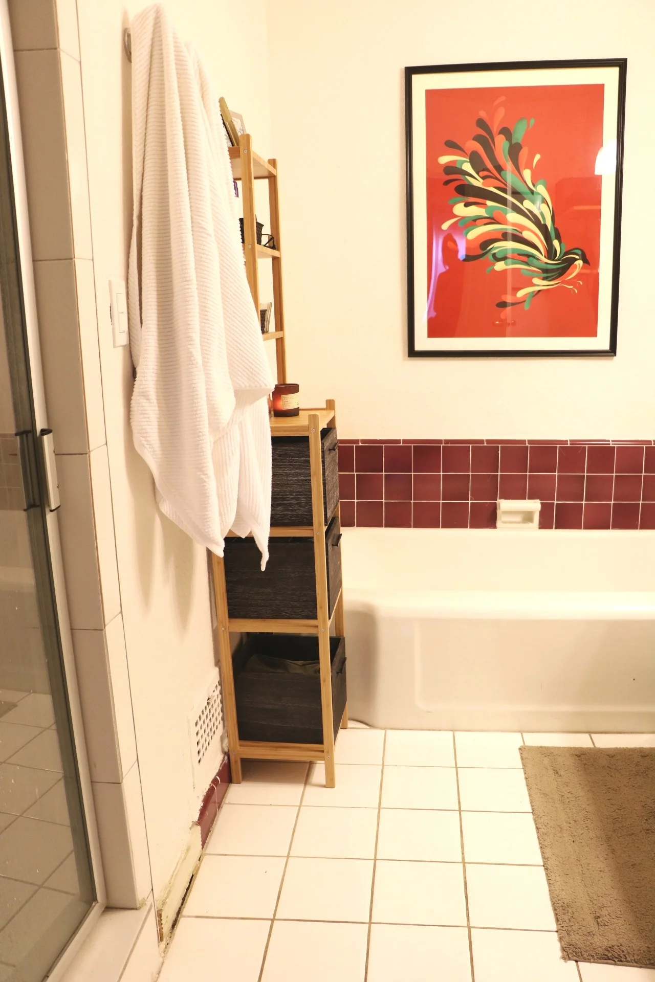
Now moving onto the other side. We already had this red poster from Society6 and in keeping with ‘embracing the red’ I think it looks quite nice above the tub. A much better use of the space than that random towel bar previously hung up.
Yes, I know the red from the poster isn’t the exact same shade as the tiling, but honestly, it doesn’t bother me. I was happy to find a place for it!
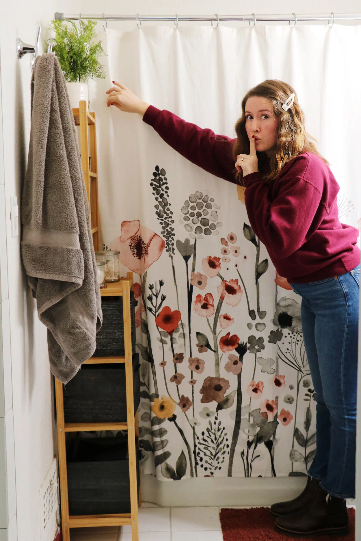
We moved the wood shelving back closer to the tub, and hung hooks for towels, as well as purchasing quick-drying white towels which are now much more conveniently next to the shower. It’s not rocket science, but it really makes a difference in our day-to-day.
Notice the wood shelves are much more organized and ‘cleaned up’ than before, courtesy of those dark wood storage bins from Target. I really had to get creative with storage in this small bathroom. I wish our apartment had a half-bath for guests, but since that isn’t the case, I wanted to minimize visibility on our daily personal-care items. The medicine cabinet above the sink helps to hold our tooth-brushes and whatnot, and then these bins hold the rest. Work with what you’ve got, amiright??
The main finishes I played around with were black, silver, and wood. I tried to keep all new purchases within those colors (like brackets, hardware, towels, etc.) and I think the bathroom looks cohesive and as much like a ‘spa’ as possible without an actual renovation. Anything you would add? Change? Comment below!


