How to Design a Primary Bedroom
It’s important to have a primary bedroom that you love and let me tell you why - you spend one-third of your life sleeping. While it may not be a room that guests see when they come over, you will spend a ton of time in there! In my opinion, that makes it worthy of a design plan that will make you happy each time you wake up in the morning. Ever wonder how to design a bedroom? Read on.
Enter: our primary bedroom makeover. The structure of the room was great, and the light coming in through the window was lovely, but it just needed a refresh to make it feel like “us”.
"We wanted it to feel cozy, peaceful and modern - with a touch of color.
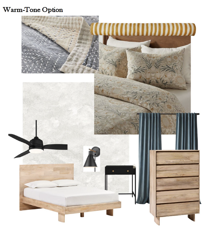
As with any project, I like to start with a moodboard (I like using Canva). What we’d picked out together was the bed + dresser, and we already had a black fan installed. We decided to use the same black nightstands from our Green Accent Wall Primary Bedroom back when we lived in Los Angeles. I presented a cool-tone option (which is funny because it still feels very warm to me!) and a warm-tone option (which ironically includes cooler colors) to my husband because I wanted him to feel included in the design process.
Disclosure: My content is reader-supported, which means that when you purchase through links on my site, I may earn an affiliate commission. Learn more here.
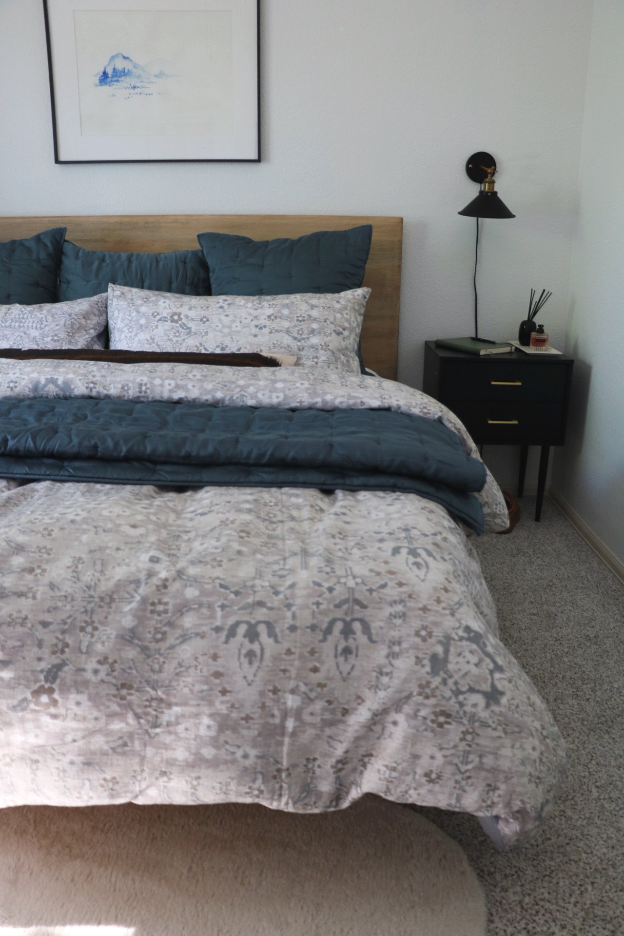
Any guesses which bedroom design plan we went with? We liked both, but ultimately, the Cool-Tone Bedroom felt more like us, incorporating both feminine and masculine elements. The mocha curtains felt like a bit of a design stretch, but they really pulled in colors from the duvet cover pattern. And looked fantastic with the lighter wood furniture. Typically, gray and blue tones pull more “cool” which is why I was calling it the Cool-Tone design. But in reality, it feels cozy and warm and balanced in the room. We love it!
But I’m getting ahead of myself…
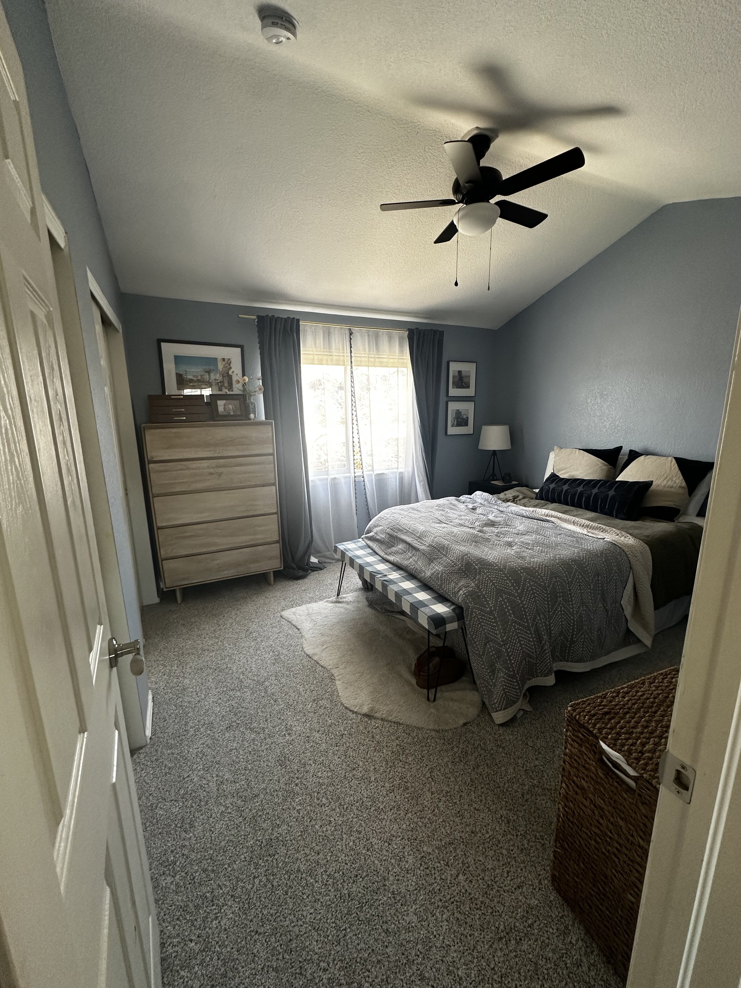
Let’s start with how the bedroom looked before:
We moved in a year ago and prioritized other spaces but let’s be real - It’s a whole lot of BLUE. And while I love decorating with that color, we desperately needed contrast. Not to mention, I didn’t love this particular shade… which happens to be in every room in the house… was there a fire sale for dark blue/gray when the previous owner painted…? I digress.
First up was painting the walls and trim before the new bed was delivered. Oh - I forgot to mention the most exciting part of this whole makeover. We were finally upgrading to a KING BED!!! Have you made the upgrade? After sleeping on it for a few weeks now, I can confidently say it was worth every penny.
I decided to paint the walls with my favorite Sherwin Williams Pure White. For the trim, I went with Sherwin Williams Dumpling. Read my post on Color Trim + White Walls for more on the topic of painting with contrasting paint colors.
After the paint was dry, it was simply a matter of placing furniture, hanging curtains, and making the bed. Who’s ready for some AFTERS?
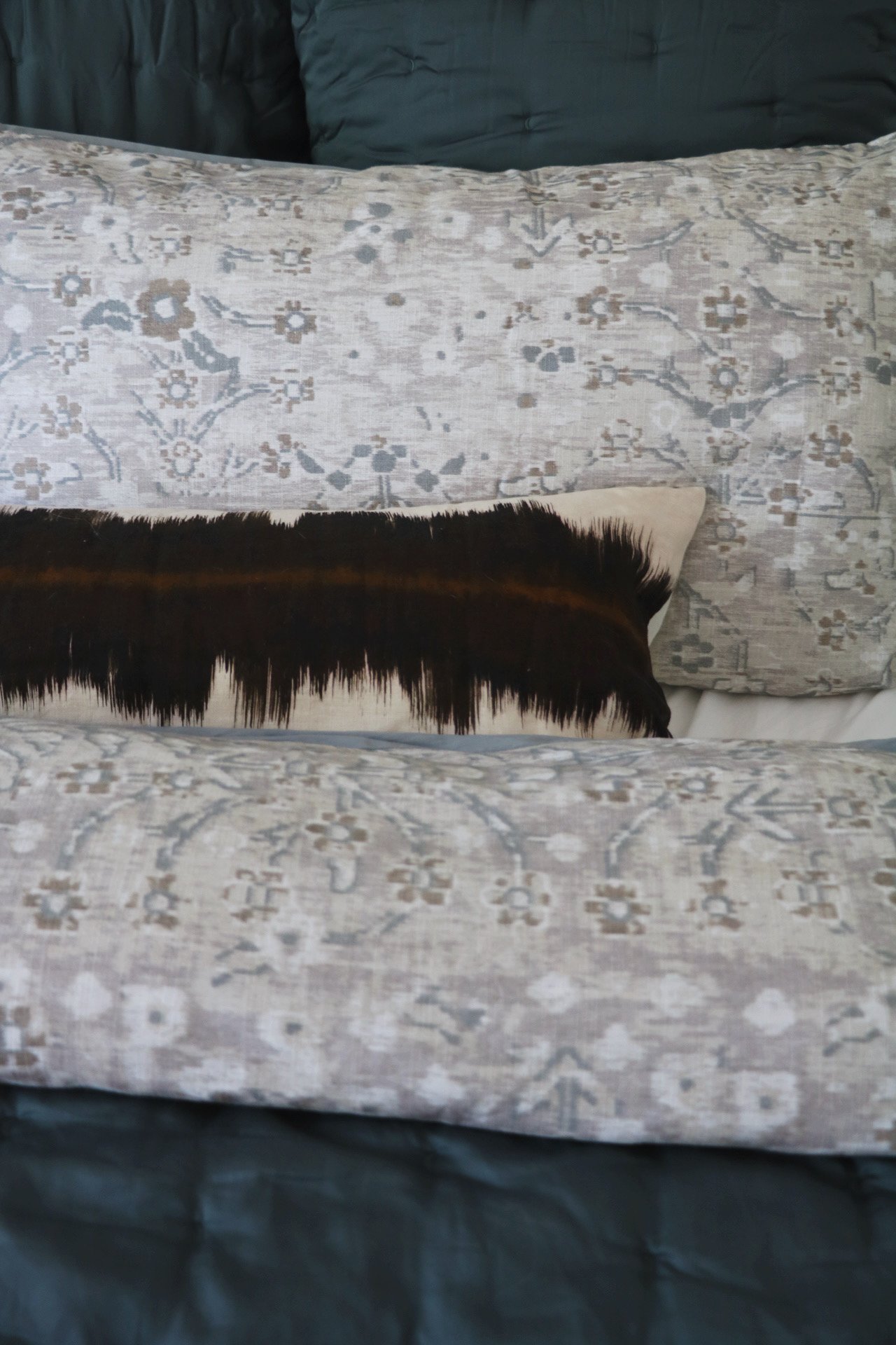
I don’t know if there’s science to back me up here… but I swear I’m sleeping better with a prettier bedroom. I love all the details and textures. I mixed in some vintage with the art and decor, which always lends itself to a more curated and personalized look. Future plans may include planking the vaulted ceiling or wallpaper the walls, but for now, we are fully enjoying our new primary bedroom.
Have I convinced you that you can design a primary bedroom too? I promise it is worth it.


