Modern Victorian-Inspired Primary Bedroom
It was a dream come true working with my client, Lauren, on her primary bedroom redecoration. She was not afraid to be bold and take risks, and the end result turned out pretty freaking amazing. Here’s what we started with:
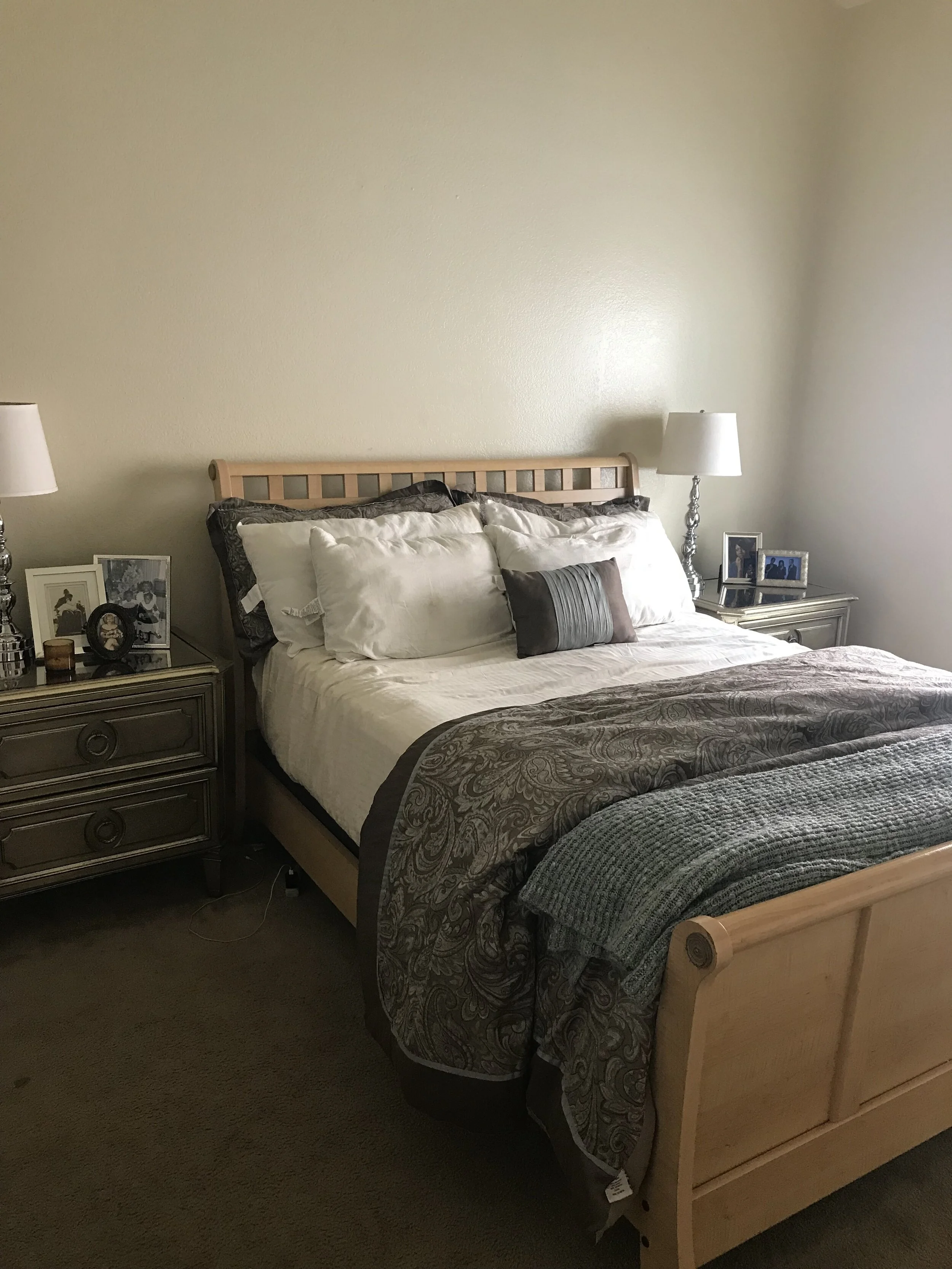
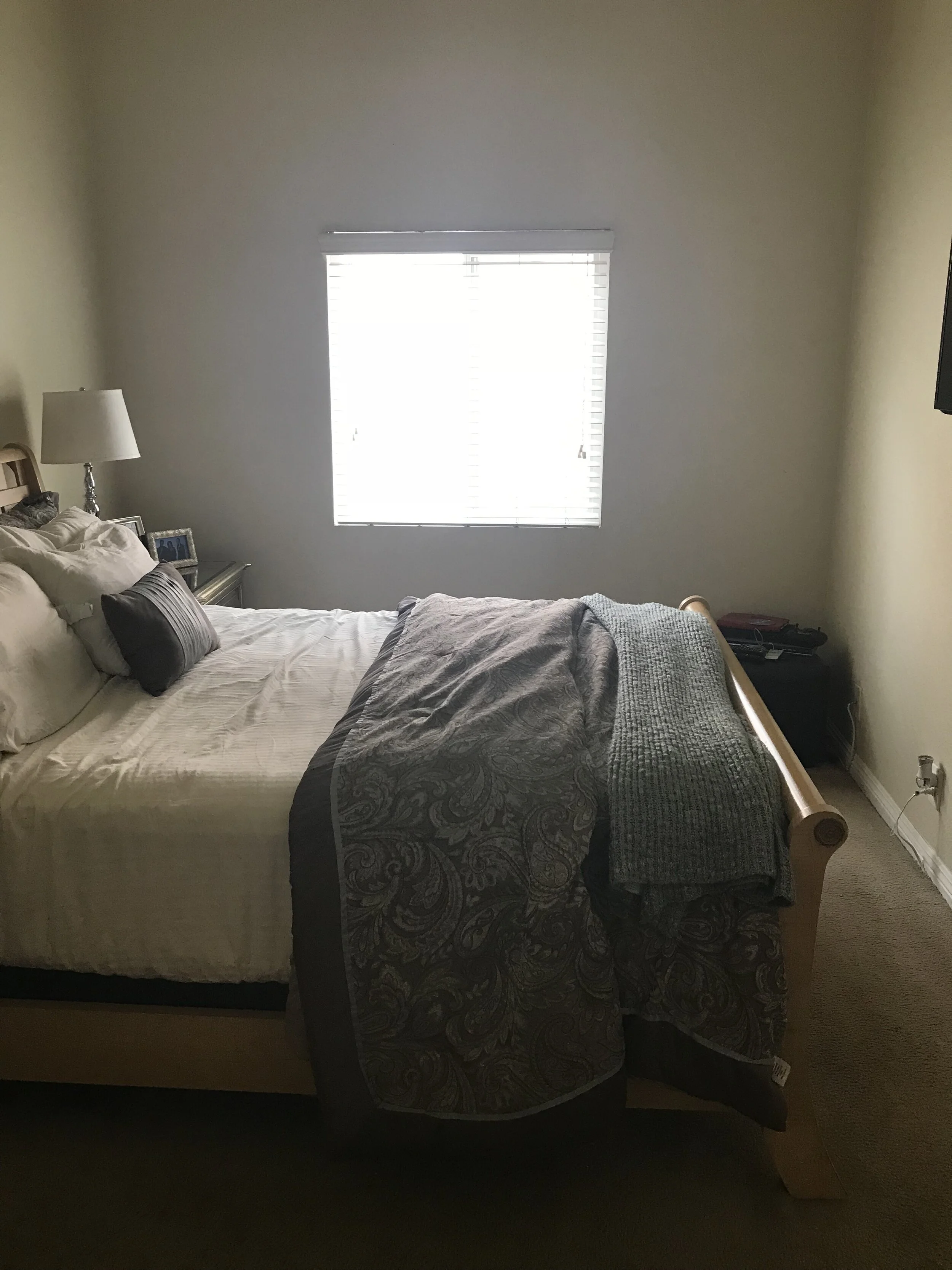
The wonderful part about the space were the tall pitched ceilings. They made a very small room feel much bigger. Since we didn’t have a lot to work with in terms of space, it was all about making the most of the square footage we did have. So, the focal point of the room needed to bring the eye upwards.
The words Lauren used to describe her dream space were LUXURIOUS, MODERN, TEXTURE, BOLD, COLOR & RELAXING. She loved the idea of making it feel like a high-end hotel room. Other items on the wish list included a bigger bed (current one was a Queen), a bigger TV, new floors, window treatments, and most importantly, an accent wall.
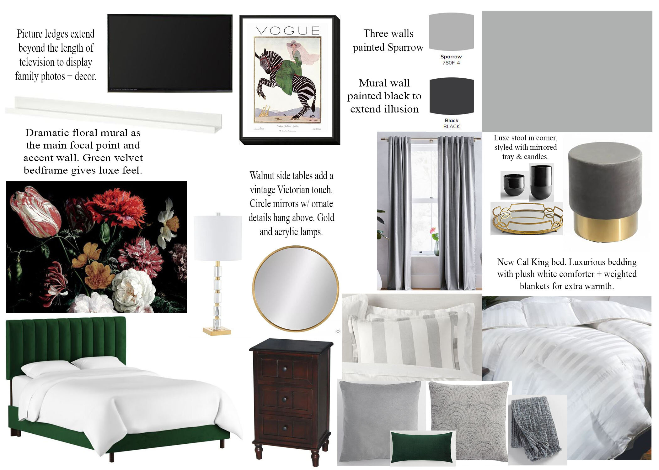
After measuring the space, I realized we could fit a California King in there, as long as we picked the right bed frame, and replaced the nightstands with narrower options. I summed up the overall style we were going for as Modern Victorian: modern for the use of metals, mirrors, and materials, Victorian for the colors, floral mural, and velvet accents throughout. See below for a glimpse at the moodboard and design.


First things first, we replaced the carpet with hardwood floors to match the rest of the house. That alone made a huge difference!


Now we were ready to paint and install the mural. This was no easy feat!! I’ve literally never seen such a big ladder as the one the painter used to reach the tops of those ceilings. My hat off to you, my friend!!
We used BEHR paint for both colors. I’ve continually been impressed with this product, so I recommend spending the extra money because overall your paint will go on smoother and you’ll need less coats.


Why did we use black you ask? The mural, which was a custom order from Etsy, was 11-feet tall, which was about as big as it could get. The ceiling, however, was closer to 13-foot at its tallest peak. I decided to paint the last few feet BLACK, since the mural faded to black around the edges, and at that height, the illusion would be that it extended all the way to the top. I was a little nervous about this, but after finishing I’m so glad to have made that call. You couldn’t tell at all that the mural ended at 11-feet.
Not gonna lie, this mural was very difficult to install. Definitely a two person job. Even though the artist gave very clear instructions (God bless him), it was just so HUGE, and you had to line up the panels perfectly to give the illusion that the mural was painted on the wall. Would I want to install such a giant again? Probably not. Was it completely worth it for the drama it gave the room? ABSOLUTELY.
Here’s what it looked like without any other styling in the room. I could have sat there and stared at it all day **swoon** Can you even tell where that black paint is? (please answer ‘no’ because I sure can’t and I was the one that did it!)

We found a green velvet bed from One King’s Lane that was beautiful quality and I loved both the color and the texture it brought to the room. I decided to style the rest of the room in shades of gray and white, so as not to compete with the mural. Lauren liked gold and mirrored accents, and one of my favorite parts were the mirrors behind the lamps. They were anchored by the walnut nightstands that blended seamlessly with the new floors.


I am kicking myself because I didn’t get a photo of the opposite wall with the new TV!! What the heck was I thinking…?? I did, however, get photos of the accents on the wall. I installed a picture ledge to go directly under the TV for remotes and to anchor it to the wall. Before, I felt like it looked like it was just floating there. Now, it looks designed with the rest of the room. Lauren loves photos of her family all around the house, and since there wasn’t much surface area in the rest of the room, we built up! These picture ledges were the perfect spot to layer photos both hanging on the wall and leaning against it. The little bud vases will look cute with or without greenery.

The curtains were hung high above the window, and extended all the way to the floor. This gives the illusion that the window is much bigger than it actually is, as well as draws the eye upwards. There was just enough room for a small accent stool in the corner. You could leave it plain, or style it with a mirrored tray + flowers and candles.

I am thrilled with how this room turned out. I felt like I was transported into a luxury hotel, and hopefully it’s a place that brings relaxation and comfort to Lauren. Have any questions about the products I used? Feel free to comment below!